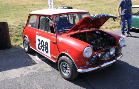
Being a ship builder the front wing has double curvature …. So when you put letters on a bow of a ship the S & C are smaller than other letters & when fitted look right.
Traditionally the O in P&O was always larger on the flat side of the ship so it looks right against the P from a distance … this has changed in the last 10 years and it does not look right to me.
For front number plate - keep letters / numbers to minimum to get right look