For those of you who are not members of the MSSC, the following article appeared in the December 2007 issue of the Club magazine (page 25).
At the end of September news leaked out of a new initiative from the Morgan factory. It has been decided to update the design of the Morgan wings from 2008.
You may already have noticed that one or two dealers are now using the new wings in their advertisements. Rather than a totally new design, the new logo is an evolution of the existing car badge, but with the wings swept upwards, rather than down in a 'moustache' shape as before. It is intended that this design will be used for all logo purposes, rather than having different ones for the car badge and PR purposes as before. At the same time, all the company's brochures, website, etc, will be revised to feature a new, unified design using the same logo and styling. The Factory's merchandise will also be updated to match.
Initial reports on the Internet to the news was surprised, and frankly pretty negative. The reason for this was not just dislike of the new shape but the idea of changing it at all. However, although it is a long time since it was last restyled, the Morgan logo most of us know from the front of our cars does not date back to 1909. Like the iconic front suspension, the design has actually been adjusted in a number of large and small steps over the years.
There are two outgoing logos: the one on the car and the one used in brochures. The brochure version, with a 'parting' in the 'feathers' of the wings was introduced as an unchromed car badge, made from pressed brass, on the first four 4-4's in 1936, but was soon changed for a cast, chromed version to a different design - the one used for the MSCC logo on the front of Miscellany. This was more than half an inch thick at the centre and distinctly three-dimensional. This was used until the 1970's when a flatter, more aerodynamic version was introduced, used until now. For whatever reason, the more 'ornate' 1936 version has remained on the Company's brochures and PR material to this day.
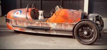
However, this is not the 'original' design. THe three wheeler Runabouts, with their coal-scuttle front ends, didn't have a badge at all, having the Morgan script painted onto the nose instead. The more sporting Aero and Super Sports three wheelers had a winged badge, with short upswept wings, the inspiration for the Morgan Centenary logo.
As well as badges, three wheelers and early 4-4's had other Morgan emblems on their radiators. In the 1920's Morgans were often seen with a large flying stork mascot on their radiator caps, while the upright radiators of the 1930's and 40's F-types three wheelers and Series 4-4's often had a "Flying M" mascot attached to the cap.
It has been suggested that the new logo is an attempt to follow the current trend, as it does look superficially like the BMW Mini and Aston Martin badges. The press release announcing it refers to a desire to make the design more contemporary, and some Aero owners feel it will suit their cars better than the current badge. However, when you compare the current badge design, the three wheeler badge design and the new design, you could interpret it as combining the historic and more recent designs into one, which would be quite fitting for a company approaching its hundredth anniversary. At least, that's one way of looking at it!