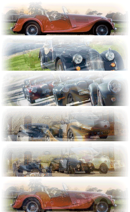
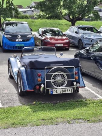
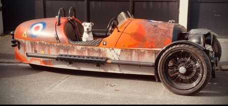
the REAL Morgan icon is the enduring Morgan car shape rather than the old wings logo.
Hi Lorne
Quite agree that the car shape is very distinctive, and even an icon in itself. Would also agree that the different Morgan logos and typefaces do not have the same impact with the general public as any of the large manufacturers, but how much of that is due to the variety and changes? The Ford logo has not changed that much since 1928, BMW have never altered theirs.
As to 2009 being a celebration of the past and the people, yes I’ve already agreed with that – but surely those involved will enjoy the events themselves, regardless of whatever logo is used, especially if as Rod says “Most people are interested in the cars and not in any logo”.
My contention is still that as well as our own ‘internal’ celebrations, there will hopefully be a lot of media exposure to the general public, of whom “many will not know the company has been around for 100-years” (Simon). It would appear that we agree on the impact of a logo, I just feel that continuity is important – especially for an occasion that will reach a wider audience.
However, if the anniversary will remain more of a ‘private’ event, without any outside coverage I would fully agree with you. If not, not!